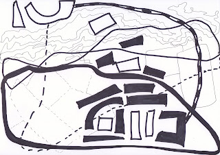
Source material for sample-making was brought forward from assignment 4-above... line drawing of the defensive pit, Rough Castle Fort by the Antonine Wall...There was a continuing focus on preferred line, shape and colour schemes with screen printing. I liked the use of bright, vibrant colours with a mix of shapes from part 4 including the use of the positive and negative spaces above. The mix of imagery selected which was used previously seemed to work well together so I wanted to carry this forward and to develop more tonal texture with line, shape and colour.
From the Roman artefacts especially the old maps of local Roman sites a range of shapes and lines were developed from the symbols used. Line drawings were created for the previous assignment whereby elements of the drawings were used for this process, specific shapes and lines were experimented with in increasingly abstracted ways with increased scale as I was increasingly influenced by the main exponents of abstract expressionism especially Robert Rauschenberg.
Above. Documentary evidence from Scotland's People which constituted part of my personal archive. From my work through part 4 I have been increasingly drawn to use a range of imagery including text with broad expanses of colour, line and shape but in more abstracted ways. The bottom section entitled Fenton, my paternal grandmothers family was cut away and its scale was increased through Photoshop to increase its meaning and relevance.
Above. The Roman Chamfron was an example of the craftsmanship with its intricate shapes and lines. This personal object was made with such care to protect a horse and for ornamentation during Calvary displays so I wanted to honour that part of Roman life. The shapes and lines were used as part of the experimentation process with shapes, line, colour and texture.
The Roman coins above acknowledged and celebrated Antoninus Pius and his conquest of Central Scotland and the building of the Antonine Wall. Their shapes interested me as not a precise circle and I wished to experiment with varying shapes and lines.
The template old map of local Roman sites above was used as the frame of reference for my related artwork and use of varying symbols as influenced by a range of textile artists. Like text... map imagery worked well with a mix of shapes and line to add depth, through layers of meaning.
The Antonine Wall at New Kilpatrick Cemetery, Bearsden was used extensively throughout the last assignment as I wanted to use this image as the foundation with a mix of singular and groups of rocks and stones as this image has been such a concrete piece of evidence that the Romans were here.
Another personal artefact...The Roman shoe from the Huntarian Museum collection at the University of Glasgow was stripped down to a series of shapes to aid the design process. Through the process of abstraction parts of artefacts were used to create a different viewpoint and perspective of the Romans based upon overlaid shapes, lines, colours and textures.
Once a range of single/groups of shapes had been extrapolated from the objects, documents, artwork and Roman artefacts... selected larger scale card stencils were made and used from white A3 card. I enjoyed experimenting with colour, line and shape in my A3 sketchbook to evaluate the effects and inform further decisions and choices. This shape above stemmed from the old Roman maps.
Another stencil was created from the old Roman site maps and the symbols used. I liked the stencilling effects on paper with the mix of colour.
The above stencil highlighted the shape of Roman coins with their imperfect symmetry which were used locally in forts by the Antonine Wall. I felt it was important to represent something of their shape and significance in the sampling process.
The above image originates from Roman sandal footwear and the intricacy of its craftsmanship has been promoted. A range of different shapes and colours were experimented with to ascertain what layers and shapes and colours were required through the screen printing which best matched this idea of expressive abstraction.
This group of shapes came from the stones and their configuration from the Antonine wall Imagery at New Kilpatrick Cemetery. The continuing focus on the arrangement and placement of imagery continued with increased abstraction.
This group of shapes also came from imagery from a site visit to the Antonine wall at New Kilpatrick. Again I liked the arrangement of larger stones and I thought it would work well contrasted with other shapes.
Many hand made stencils were created to aid the process of experimentation with shape and colour to work out what layering suits best. The stencils above were all from the Roman shoe as many different shapes were extrapolated from this one Roman object.
As above...additional stencil from the Roman Chamfron with its unusual shape and form, of the artistry of Roman Craftsmanship and its place within Roman ideology.
Increasingly a mix of shape and scale with colour was experimented with...in the process of hand stencilling in the A3 sketchbook. I was aiming to construct an equivalent pattern book from Roman finds-Artefacts, related artwork, personal archive and Roman map sites and symbols.
The stencil above was derived from a part of the defensive pit photographs and artwork from a site visit to the Rough Castle Fort and the Antonine wall. I like the arrangement of the forms and how they interrelated with the other shapes used.
The above stencil originated from the old Roman site maps and the related symbols used...their geometric shapes contrasted well with the more natural imperfect shapes...to help evaluate what shapes, forms to use with the preferred colour scheme, which was carried forward from the previous assignment work. I wished to represent this series of imagery as a continuation of what went before, to evidence my development of the same source materials but with a different application and further distortion of the imagery.
Many hand made stencils were cut out and used during the extended stencilling process whereby the stencils were printed out onto my A3 sketchbook, A3 and A2 white cartridge paper and card. Screen printing paste was used diluted to varying strengths of colour to best replicate the screen printing process to help ascertain the preferred use of stencils for the screens and also the hand stencilling processes during the fabric printing processes.

Four 80cm x 62cm screens were purchased for this series of screen printing... see above & below. From the sketchbook work and the series of hand stencilling processes onto card and paper the above image was selected for one of the screens given its mix of shapes, colours, tones, brushstrokes and use of positive/negative space. Since I wanted to work with increased scale I used part of the original stencilled image and increased the scale further through Photoshop and altered the tonal values of some of the shapes to provide greater versatility within the one screen.
Again through Photoshop I altered the scale of a piece of text from my personal archive which was cut out of the original document and its overall scale was increased to use on one of the screens. I valued the personal nature of the document, the writing style and hand writing. The edges were cropped as appropriate to help avoid straight lines and to help situate it within the textile sampling process.

The two remaining screens were used for my charcoal drawings of the stones from the Antonine wall. The focus was on the placement and arrangement of shapes to help create texture, contrasts, a greater tonal range with more impactful layering within the screen printing sampling process..The charcoal hand stencilling processes came from earlier experimentation with hand stencils using charcoal when screen printing. I liked the textural effects from the charcoal and lithography pastels on paper, card and fabric and I thought their use with the source materials would enhance the sampling process. More texture was deemed necessary to give added depth to the screen printing process
As stated above two examples from the charcoal drawings was considered necessary to provide more options to mix and contrast the imagery in use. Many hand stencils with charcoal and screen printing paste for colour testing for later screen printing.
The start of my A3 sketch book for part 5 included links with what had gone before during part 4 which centred upon documents from my personal archive, Roman sites, artefacts and maps with artwork.
From the sketchbook I tried to explore and link meaning and messages with line, colour, texture and shape. As stated I selected the imagery that had personal significance and resonance, that I felt a connection with and to. I tried to use examples of key source material which had been carried forward to part 5.
From the outset I was entranced by the Roman shoes especially the sandals with their design quality and personal relevance, it was easier to relate with the lived life of the local Romans through their personal items including their shoes. I loved their shape and the shapes from within the sandal itself which generated so many shapes for the hand stencilling processes.
Another sample page from earlier sketch books from part 4 illustrated connections with and progression on from earlier sampling of whole objects which was disrupted and broken down during part 5 into a series of shapes, colour and line.
Again I tried to highlight the use of my personal archive which was researched and compiled previously but which continues to inform and define the sampling process through the use of text and line.
Abstract Expressionism has become an increasingly significant influence as I have realised my love of colour and shape. I undertook additional research before starting the stencilling process to help inform my decisions concerning the placement and arrangement of colour.
As with Willem de Kooning I am drawn to lots of areas of colour interspersed with tonal line. I wanted to experiment with increased abstraction of shape with increased scale.
Throughout part 4 I enjoyed using a selection of colours which I wanted to continue to use, to offer a thread which runs through all the sampling processes. I thought the colour scheme offered a range of options on dyed fabric and it had proven to be sufficiently versatile previously.
From my sketch book I started to experiment with coloured shape and line from the Antonine wall and the defensive pit forms. A number of exerts have been included to help demonstrate my creative process from the dozens of sketches completed. This helped to immerse myself in the process of making.
I liked the use of line, shape and colour to create additional areas or shapes to start the layering process.
From exploring line with shape and colour I started to experiment with colour and shape over colour and shape. I liked creating the negative space as much as the positive space.
I then explored my colour palette and overlapped a mix of colours with shapes to enhance my knowledge and understanding of what works best. Initially collections of shapes and colours were contrasted on paper in my sketch book.
From starting neatly page by page I ended up removing lots of pages from my sketchbook so I could compare and contrast the use of shapes and colour side by side on the garage floor.
I enjoyed creating different effects and mark making using different colours and shapes layer by layer.
I soon realised how much I enjoyed using stronger colours especially the oxblood screen printing paste with other colours.
As I progressed I deliberately played around with the application of screen printing paste and mark making, of applying the paste less precisely to create more brush strokes and areas of light and dark.
I explored the way the colours and shapes overlapped and merged to help inform my screen making choices and processes.
I reflected upon the interplay of colours and how each colour affected other colours, of how the oxblood appeared even stronger against specific colours for example.
Increasingly a more diverse range of shapes was used during the hand stencilling process with an increased colour scheme using the screen printing paste.
From using the shapes created from the Roman shoes and chamfron many design variations were created with varying success. I felt the example above worked well with the range of shape and colours selected. I liked the progression from lighter colours to stronger colours and how they appeared in connection with each other and the negative space.
I used different colour combinations to experiment with various arrangements and configurations, to increase my understanding of colour, line, shape and texture for screen printing.
This example above was one sketch that proved less successful as the oxblood coloured shapes seemed to suffocate what lay underneath. The idea was that all the colours, shapes and line would be seen and shine equally.
While continuing to deliberate over colour and shape I also wanted to explore texture through the use of screen printing paste and the brush marks. Some versions proved more successful than others as I experimented with dozens of different versions.
The mark making became more sketchy to create an uneven application of screen printing paste and greater areas of interest.
On reflection some of this mark making originated from and mimicked the marks left from the use of hand stencilling processes as outline marks were left which I felt added to the shapes added interest.
Increasingly I deviated away from using only the stencils and used a combination of one off shapes with and without stencil use with more colours. I really enjoyed the total immersion over many weekends of experimenting with colour, shape, line and texture.
I was continually struck with how the same shapes, use of line, range of colours and textures could produce such a variation of designs.
While some design variations worked better than others...like the example above which seemed unbalanced as dominated by the large yellow ochre shapes in the foreground I never the less always gleaned something from each experiment which informed the next. From this example the use of certain coloured shapes and their placement was realised.
From this example...I learned as much as I love oxblood as a colour it can easily dominant to the detriment of the overall design.
As the process of experimentation with colour and shape progressed I became more adventurous when using cut out stencils and painting on paper from my sketch book. The experimentation helped me to more clearly formulate my ideas about the screen printing process and what I wanted from it. Increasingly I liked the mix of shapes with colour which helped me to decide upon the use of hand stencilling and masked off areas in between the use of screens when sampling with fabric.
I enjoyed being bolder with a wider range of colour and shape with texture from the application of the screen printing paste. I increasingly integrated oxblood and burnt orange into my designs which I had not initially expected to do.
I progressed onto using more single coloured shapes with and without the use of my hand made stencils to focus upon more detail and the interplay of specific colours and shapes.
Using most of my colour palette I experimented more widely with increased colour use to bring more vibrancy to the designs.
The above example did not work as well as the placement of the shapes meant areas were cut and not seen which left the overall effect unfinished.
The above design seemed lacking in the use of negative space and was generally uninteresting with its colour use.
Sufficient use of negative and positive space well balanced seemed to make any example work.
Sufficient use of colour with contrasting shapes worked much better as in the examples above and below.
Again the examples worked well above and below due to the sufficient mix of variation and colour.
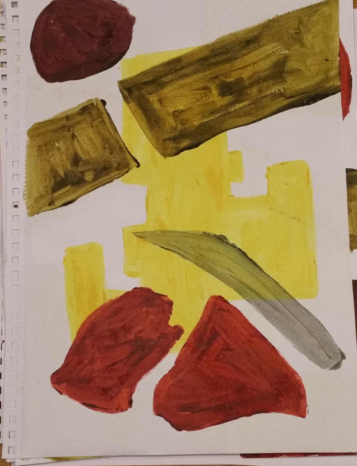
I liked the colour schemes in the few examples above, the burnt orange, dirty yellow, grey-green and yellow ochre worked well together.
Continuation of experimentation process with a diverse range of shapes and colours to help evaluate preferences.
More negative space was left and its effect was considered...as too much negative space can leave a design looking insufficient and unfinished.
Increased use of oxblood and burnt orange within the colour schemes seemed to bring the design to life more, there seemed to be increased vibrancy and depth.
From the sketchbook work I enjoyed exploring the use of shapes, line, colour and texture and my response to what I had produced, and how it informed my continuing creative process, of how it affected my next series of choices and decisions during the compilation of subsequent designs.
Continuing analysis of negative space, of shapes-outlines and colours overlapping to create new outlines and shapes.
Straight lines contrasted with curved lines from a range of shapes, colours and scale to examine the effects.
Overlapping effects explored at depth to help with the screen printing processes in practice...the use of shapes, colours, line and texture.
Increased understanding of preferred colour schemes, shapes and texture, of the need for sufficient texture through the brushstrokes. Another contrast required.
Increased recognition of the use of colour and shape as part of the layering process when screen printing.
There was increased learning and understanding of the use of colour, of how one colour overlaid with another affects one another, of how colours side by side are seen, of how colours can appear lighter or darker.
From such extensive sketch book work including hand stencilling I felt more responsive to the use of shapes and how they interact and interrelate with one another.
Parts of the paired down shapes were increasingly played with as well to evaluate their usage through the sampling process with fabric.
I increasingly enjoyed being more experimental with my use of colour and shape using parts of shapes with the full colour range.
From completing such a number of sketches I was able to more readily recognise from such a process what worked and didn't work like the example above which proved to be a less successful arrangement of shapes and colour scheme with too many similarly sized shapes.
From the sampling process using paper, card and screen printing paste I became increasingly aware of what I was looking for when screen printing. I could see that added texture was required and that the brush strokes did not within them self add enough to the design process. The above use of shapes and colour seemed to be a more successful arrangement of shapes and colours with sufficient contrasts for example but another layer of textural contrasts was required. From the previous use of artwork using charcoal and lithography pastels for screen printing I experimented further with the screen printing paste, charcoal and lithography pastels to add texture, see below.
Continuing sketch book use...Selection of charcoal drawings from source material using hand stencilling and screen printing paste to help to understand the possible mix of texture-charcoal with brush strokes. This process helped me to use texture more with colour, line and shape.
In using a range of diluted screen printing paste with the preferred charcoal sketches I was soon able to develop ideas about what I wanted to be on my four screens for screen printing onto dyed linen and velvet. I became increasingly sure about my use of strong contrasts using oxblood screen printing paste. I liked the universality and diversity of the shapes which stemmed from the defensive pit by the Antonine Wall as the shapes could be used any way round.
On reflecting upon the use of charcoal sketching even with more subtle colours like olive green the use of charcoal seemed to lift the colour and shapes...to make the overall effect more dynamic.
From this sampling process with charcoal and screen printing paste I experimented with lots of different shape configurations and use of colour.
Some of the shape arrangements and colour placements worked better than others...despite this I continued to learn. I liked to explore the use of colour beside and on top of the charcoal to realise a mix of effects.
I compared a range of colour effects with charcoal including more sketchy approaches with blocks of colour.
Some versions I explored overlapping effects with the use of light and shade to generate more ideas for layering.
With other examples I explored colour more with different strengths, applications and placement of screen printing paste to help compare and contrast the use of colour with charcoal.
As stated above...I liked to experiment with variations of screen printing paste especially burnt orange with charcoal to evaluate its effects.
The use of colour above proved less successful but the mixed shapes seemed to work well, the more dynamic use of charcoal improved the overall effect. That said I became increasingly aware that I was naturally drawn to the stronger colour palette.
More complex shape-pattern configurations were explored using charcoal with the stronger range of screen printing paste.
While I liked the more complex arrangement of shapes using charcoal given the overall use of additional groups of shapes through the use of four screens I did not wish to make each screen too busy. From the examples above and below further charcoal work with screen printing paste is anticipated after completion of part 5.
From the research above a series of charcoal drawings were completed and scanned for use on Photoshop, see below. Eventual selection was informed by the sketch book work and how the charcoal drawings could best be used with the colour and line-text.
From the series of charcoal drawings completed the example above was selected for a screen. It was felt that this arrangement offered a lot of options for screen printing and contrasted well with the screen immediately below.
The charcoal drawing above was also selected given its capacity to be used any way and its dynamic use of charcoal with light and shade to add form with texture.
While I liked this charcoal drawing I felt it may be too restricting through the screen printing processes.
This charcoal drawing which originated from the old maps of local Roman sites and the related symbols used proved to be interesting but not ideally suited to the layering effects within the anticipated screen printing processes.
More charcoal drawings which used map symbols from the old maps of local Roman sites looked promising but ultimately I preferred to select a group of shapes which offered greater versatility when screen printing onto fabric, see above and below.
From this sketchbook work and related art work I compiled twelve more resolved versions of arrangements of coloured shapes on A2 white cartridge paper to enable scanning and manipulation of imagery through the use of Photoshop to further aid the eventual selection of one arrangement for a screen, see below.
While I liked the colour use and the contrast of shapes the overall effect was not sufficiently different from the charcoal drawings.
I enjoyed the use of a mix of shapes which seemed to work well but when the charcoal drawings were overlaid it proved to be less effective.
The coloured shape arrangement seemed to work but was ultimately more limited when compared with the charcoal drawings and text.
The use of larger blocks of colour with tonal variation proved more successful with the charcoal drawings and use of text.
Another variation of the coloured shapes from the stones of the Antonine Wall with other mixed shapes was considered as the colour scheme with its use of oxblood, yellow ochre, grey-green and olive green worked well together.
While I liked this design I felt it was not suitable for this screen printing process. I started to consider some sampling options using ink jet printing with different background colours.
When the charcoal drawings were overlaid... this example proved to work well and created many varying elements of interest with the text.
On reviewing this example I thought this could be used to produce some additional samples through ink jet printing to help compare and contrast with the use of screen printing processes.
This example made me think about the use of different shapes and the negative space more but I realised that larger blocks of colour were required.
These coloured shapes proved to be a favourite as I repeatedly returned to using them so I aim to produce samples using a selection of such arrangements through ink jet printing.
More experimentation with more colours and shapes to evaluate what colour and shape works best together.
Further exploration of shape and colour above to help conclude the final arrangement selection for the screen...See below-final selected colour and shape arrangement.
Photoshop and editing with cropping options were used to experiment with tonal variation for screen printing, to accentuate the texture made through the brush strokes.
Variations of tone was played with to help to compare the overall effects which will create the best tonal finish when screen printing.
As variations of tone was highlighted the brushstrokes became more prominent and relevant to the image.
This image was then cropped to best highlight the tonal variation and to increase scale so a range of scale would be in use through the screen printing processes.
Final selection of image for the screen printing process above given the range of contrasts, shapes, texture and use of positive/negative space. The related imagery above highlights the tonal variations and the eventual selection of part of the image so the overall scale could be increased further.
Below-Evidence of the Sampling process with eight separate screen printed samples (72cm x 54cm)
Once the eight samples were completed some time was taken to deliberate what samples had been successful and what samples were less successful and why.
From reflecting upon the sampling process I realised my preferences for the mixed shapes screen with tonal variation, of how well it worked in print both on linen and velvet, see middle lower sample above. I enjoyed using contrasts including the oxblood screen printing paste on the olive green linen.
That said the smoke grey cotton velvet with oxblood screen printing paste and various strengths of discharge above right... influenced my use of discharge and colour schemes in the final two more reconciled printed pieces.
Through hanging up the sample pieces I was more able to evaluate the use of screens-pattern, the layering process including the arrangement and placement of images, the colour choices and their order, the use of one-off cut out shapes for stencilling on the fabric or screen. Such a reflective process informed the use of smoke grey cotton velvet and smoke grey linen given how well this base colour worked with the colours in use. I felt able to experiment more with the oxblood and blood orange screen printing paste with discharge.
Also from the sampling process I decided to interject the use of screens with many more one-off cut out stencils and masked off areas to add increased areas of interest with discharge.
See specific information on each sample piece below including colour schemes and effects...
Smoke Grey Cotton Velvet with dirty yellow, olive green using mixed shapes screen then text with discharge. I really liked the subtle colour palette with the mixed shapes and writing...the fabric dyed and screen printed well and the discharge added to the overall finish
Smoke Grey Cotton Velvet with the Antonine wall charcoal drawings using burnt orange, grey-green then a one-off cut out shape stencil using newsprint with oxblood was printed with a blank screen. Strong discharge was used with another cut out stencil followed by the use of oxblood printed through a cut out shape which was masked off and then weaker discharge was printed through another cut out shape which was masked off. I liked the dramatic effect of the colour scheme and contrasts created using discharge.
Smoke Grey Linen with a mix of screen printed charcoal drawings in yellow ochre and then in grey-green followed by the use of cadmium yellow screen printing paste with the mixed shapes screen. A one-off cut shape stencil in olive green and then a weaker discharge with the mixed shapes screen helped to pull the image together and to create a 3D effect.
Plum Linen with mixed shapes screen including oxblood and then olive green followed by a one off cut shape newsprint stencil using burnt orange. Despite the limited use of screens the mixed shapes screen has the capacity to create interesting relational dynamics between the printed shapes.
Olive Green Linen with the mixed shapes screen using oxblood then cadmium yellow followed by a one off cut shape stencil with newsprint in burnt orange. Then the Antonine wall charcoal drawing in-part was used with strong discharge to good effect. The mixed shapes screen seemed to add depth with its mixed tonal variation and interesting positive/negative spaces.
Olive Green Linen with the charcoal drawings in yellow ochre and then grey-green screen printing paste. The mixed shapes screen was used with cadmium yellow then with weak discharge. Although this sample remains unfinished the use of discharge helped to create added interesting shapes.
Smoke Grey Linen using the mixed shapes screen in oxblood then olive green followed by a one-off cut out stencil in olive green adds depth with the bold contrasts.
Plum Linen using both charcoal drawings with yellow ochre and then grey-green screen printing paste. The mixed shapes screen was used with cadmium yellow followed by the mixed shapes screen with weak discharge. Although the colour scheme was not as resolved as some of the other samples I liked the interplay of weak discharge with the charcoal drawings.
In process-final two screen printed textiles above and below to illustrate the mix of imagery and colour as led by the earlier sampling outcomes. The use of oxblood, burnt orange, dirty yellow screen printing paste predominant with the additional use of layering with one-off cut out stencilling and masked off areas.
From the previous sampling I was bolder with my use of colour and how they were mixed and applied. I used discharge more to create a stronger interplay between the different shapes, textures colour and line.
The use of charcoal with the brushstrokes from the artwork worked well in some parts which I aim to explore more using silk velvet, discharge and devore.
The final more reconciled screen printed textiles used a greater range of screens and layering. The grey cotton velvet sample (75cm x 110cm) included oxblood, olive green and burnt orange blocks of mixed shapes with burnt orange Antonine wall section and discharged text and mixed shapes imagery.
The grey cotton velvet sample produced many interesting areas of screen printing with discharge. The block of mixed shapes with tonal variation worked well with the colours selected and offered a range of shapes using the positive and negative space which was informed through prior sampling.
The grey linen sample (96cm x 134cm) used most screens including burnt orange, olive green, dirty yellow and grey-green but more effects were created through the many masked off areas and one off cut out stencils placed either on the fabric or the screen throughout the screen printing process. A series of images within the overall image was created which generated an impactful overall effect. From this further use of the screens is anticipated with the preferred colour scheme. In addition to this more of the dyed fabric for this project including plum, smoke grey and olive green coloured silk velvet will be used to further extend my use of such imagery with a range of fabrics. Also see Learning Log.


